
I took part in the Brands Re-Imagined Brief to re-imagine Primark as a luxury fashion brand. This was such a fun brief, Primark is so well known for its affordable offering that getting the chance to re-imagine the branding for a more luxurious price point offered an interesting challenge.
Primark’s real life branding is a simple text using a sans serif font in a light turquoise colour. The choice of a sans-serif font perfectly connotes primarks no-frills attitude and light turquoise as their brand colour avoids luxury cues which aligns with its low-cost positioning whilst resonating with its target demographic of youthful budget-conscious customers.
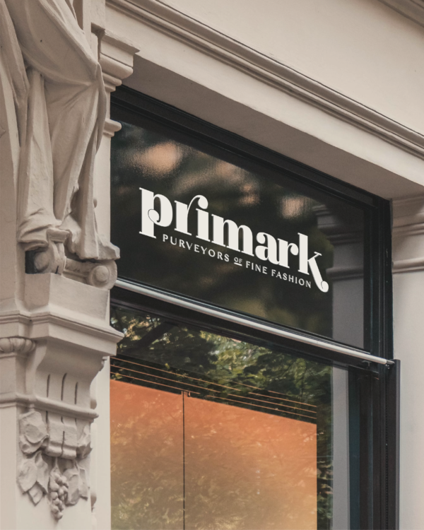
When I set about this task I knew I wanted a serif font for the word mark, whilst I believe both serif and sans-serif styles have a place in luxury marketing in this case I wanted to make the branding as much of a departure from their existing logo as I could. Taking the stem of the ‘P’ and elongating the descender of the ‘k’ to hug the brand tag creates a sense of harmony and balance appealing to an audience that values precision and quality. The brand tag itself uses a sleek sans-serif font with generous kerning giving the logo an airy and uncluttered appearance commonly seen in luxury brands like Chanel or Prada. This suggests exclusivity and timeless appeal.
The colour palette is a blend of neutral colours, these hues exude refinement and align with luxury design trends. The absence of bright or primary colors eliminates any sense of mass-market appeal, focusing instead on calm, premium, and tailored aesthetics. The logo is notably stripped of ornamentation, opting for simplicity. This approach communicates clarity and exclusivity, key elements of luxury branding. Simplicity suggests confidence in the product and the brand’s status, as it doesn’t rely on visual gimmicks.


In summary, the design choices in this reimagined Primark logo—clean typography, ample spacing, minimalist elements, and sophisticated color usage—create a perception of luxury. These elements signal a departure from its budget-friendly roots and an attempt to appeal to a more affluent and style-conscious audience.